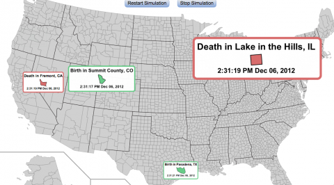
 As one Metafilter commenter put it, this visualization is cool and creepy at once. Assembled by Brad Flyon, the visualization gives you a feel for the qualitative rhythm of births and deaths in the U.S.. (Fortunately the births exceed deaths by a significant margin.) When you enter the visualization, you’ll want to give things a few moments to get going. And you can mouse over parts of the map to get more data.
The visualization itself was created with the following (and I’m quoting Flyon verbatim here):
- The 2010 population data for “Places” from US Census, which contains census information for about 30,000 “places” (cities, towns, census designated places, etc.) in the US
- The 2010 population data for US counties
- An annual birth rate of 13.5 births per thousand from page 67 of the U.S. Census Bureau, Statistical Abstract of the United States: 2012
- An annual death rate of 8.1 deaths per thousand from page 81 of the U.S. Census Bureau, Statistical Abstract of the United States: 2012

No comments:
Post a Comment